
Exploring Orange County Housing with Interactive Insights
Dive deeper into Orange County's housing market with an interactive Streamlit app. In this post, we’ll explore key insights from the data and show you how our app empowers you to uncover trends, compare cities, and make informed decisions.
Orange County’s housing market is a labyrinth of sky-high prices and endless factors—from square footage to city location—that make or break affordability. In my last blog post, I took you behind the scenes of scraping and cleaning housing data, sharing my journey of uncovering the building blocks of this intricate market.
![]()
This time, I’m taking it up a notch. Welcome to insight-driven interactivity—where data meets action. With a Streamlit App I built, you can now explore Orange County housing data like never before. Whether you’re a potential buyer, an investor, or simply curious about real estate trends, this app puts the power of exploration into your hands.
Motivating Question
Just as a reminder, the primary question guiding this project is: What are the key factors that influence housing prices in Orange County?
In this phase, I’ve gone beyond the numbers to pull out actionable insights while providing you the tools to dig deeper on your own.
Key Insights: Uncovering Trends in Orange County Housing
After exploring the data in depth, I discovered two critical insights that shed light on Orange County’s housing dynamics:
1. Location is King:
Unsurprisingly, housing prices vary significantly between cities. Coastal cities like Corona del Mar and Newport Beach consistently top the charts, with average prices exceeding $12,000,000. In contrast, inland cities like Trabuco Canyon and Laguna Woods offer more affordable options, with median prices around $500,000.
Supporting Visualization:
Below is a graph illustrating how housing prices vary across cities. This visualization is also included in the Streamlit app, where users can interact with specific cities to dive deeper into these trends.
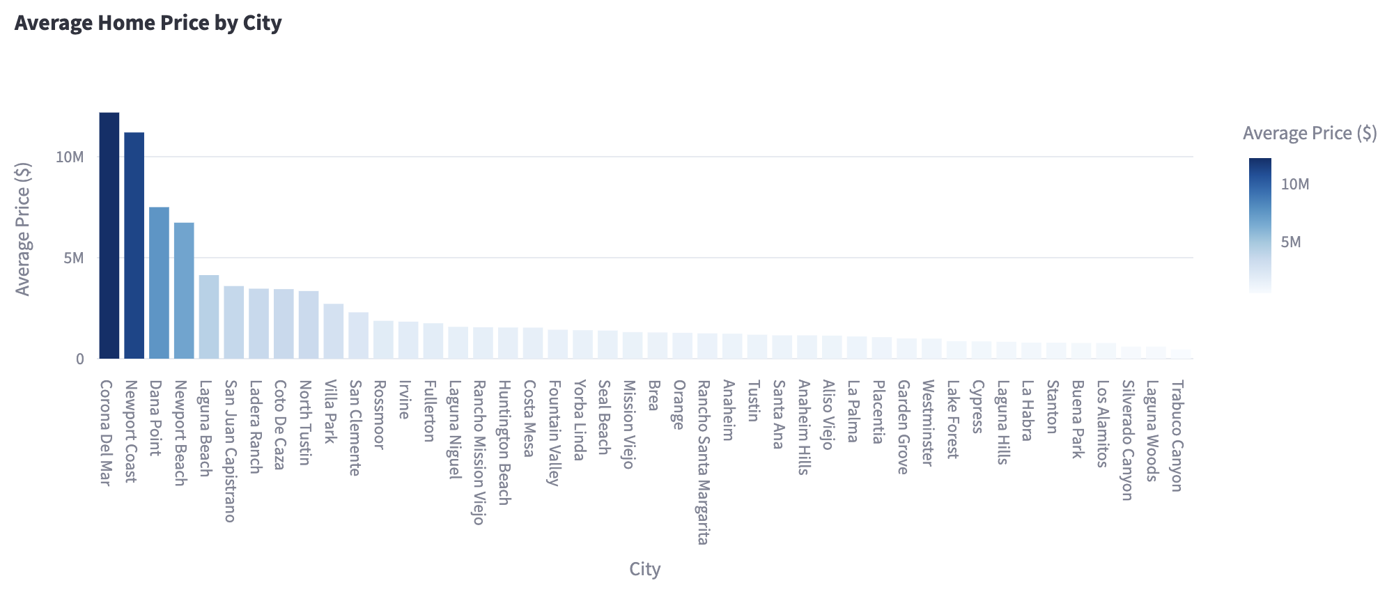
The plot highlights the wide range of home prices, showing that coastal locations often command a significant premium due to proximity to beaches and higher demand.
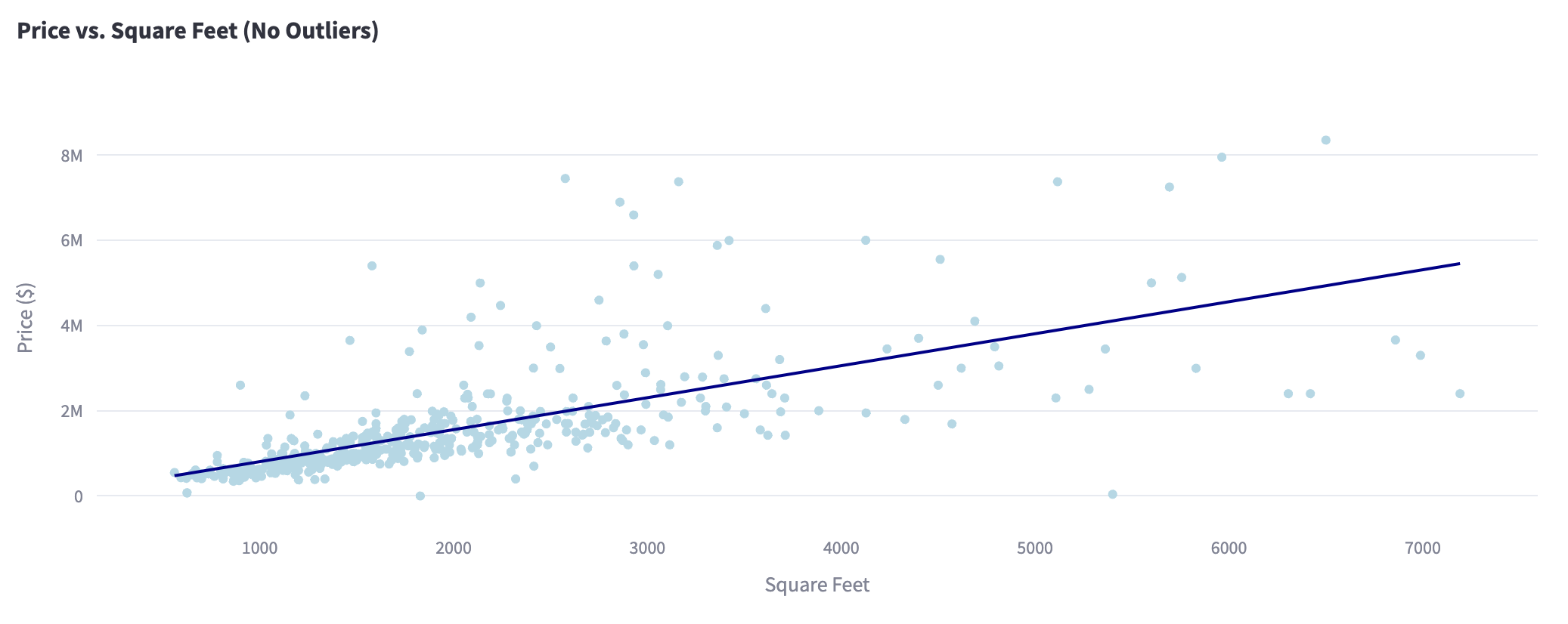
2. Square Footage Matters:
While city is definitely the largest factor in determining housing prices, square footage has also proven to be significant. My analysis has shown that square footage and price has a positive, linear relationship.
Supporting Visualization:
The scatter plot below shows price versus square footage, and the app allows you to filter by city to refine your exploration.
Introducing My Streamlit App
To make these insights actionable, I developed an interactive Streamlit App that puts the power of exploration in your hands.
What Can You Do with the App?
The app offers several features to help you dive into the data:
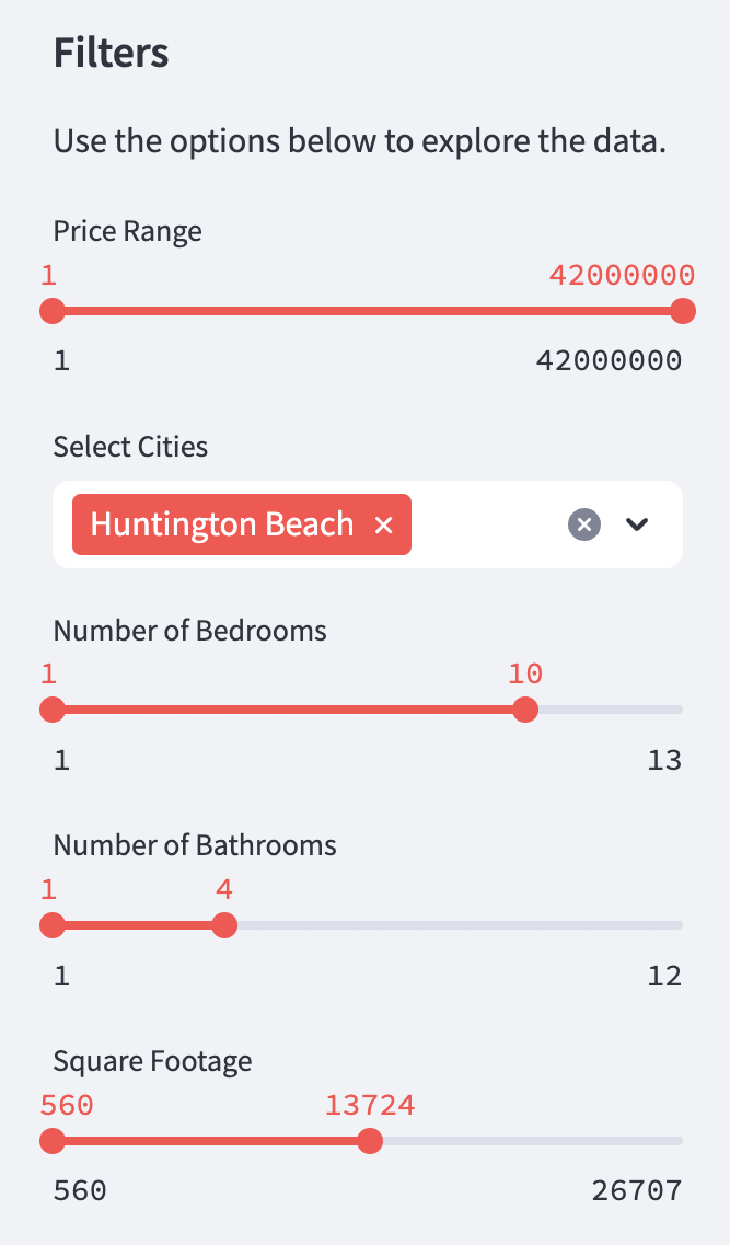
- Dynamic Filtering: Select specific cities, price ranges, and square footage to customize your view of the market. I made the default city “Huntington Beach” because it is my hometown!
- Interactive Visualizations: Explore price distributions, scatter plots, and city comparisons that update based on your selections.
- Summary Statistics: Quickly view the average, median, and range of prices for your selected criteria.
- Searchable Listings: Browse through individual property data to find homes that meet your needs. You’re even able to download your findings into your own csv!
How to Use It:
- Explore City-Level Trends: Want to know how Newport Beach compares to Santa Ana? Use the city filter to isolate trends and understand price differences.
- Customize Your Search: Adjust sliders for price and square footage to focus on homes that fit your criteria.
- Visualize Relationships: Interact with scatter plots to see how price correlates with size in your selected locations.
Example Use Case:
Let’s say you’re deciding between two cities: Irvine and Huntington Beach. With the app, you can:
- Compare average prices and square footage in both cities.
- View individual listings to get a sense of what’s available in your budget.
- See how prices per square foot differ, helping you evaluate value for money.
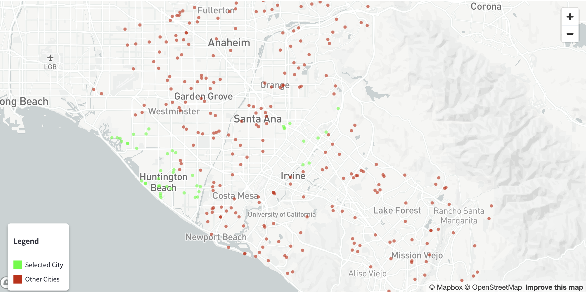
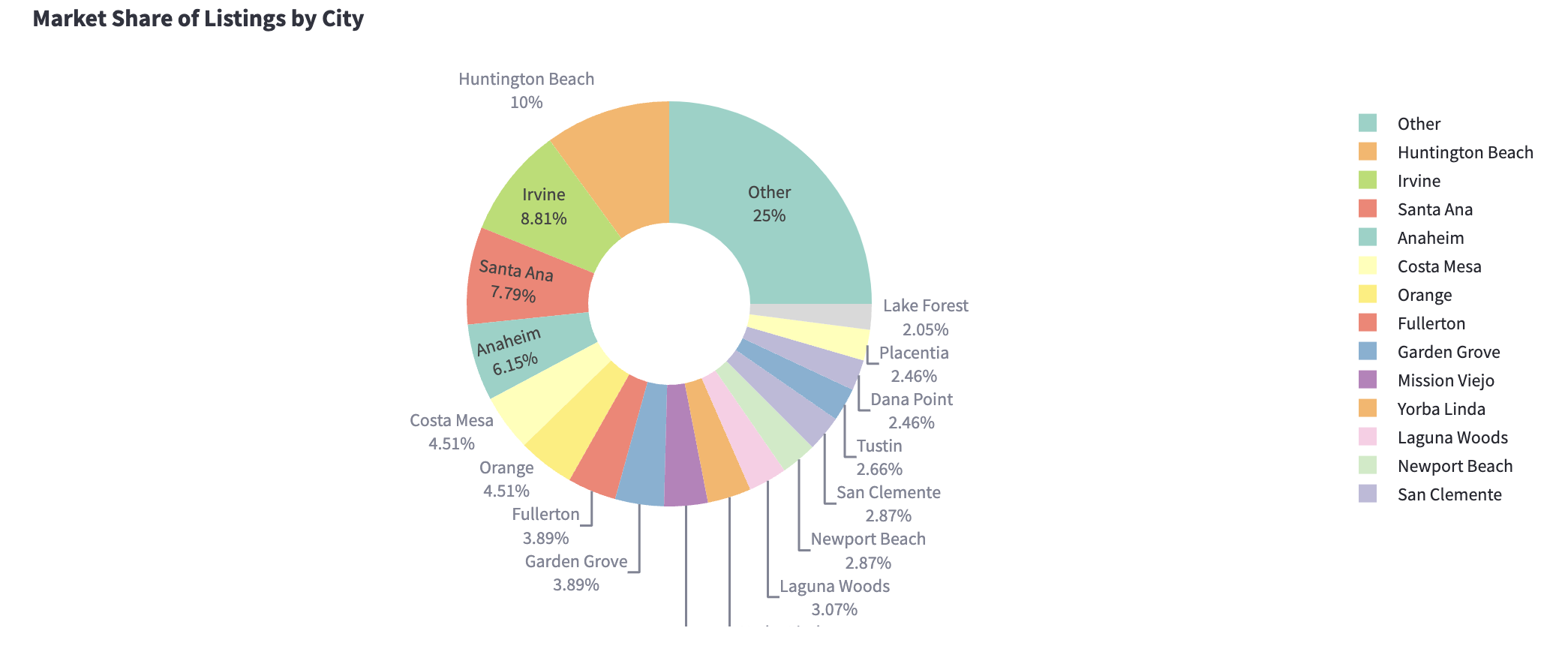
Here’s a sneak peek at the app in action:
- An interactive map that updates colors based on city selections:
- A pie chart that displays the percent of house postings per city:
Why This Project Matters
Understanding the dynamics of Orange County’s housing market isn’t just about numbers—it’s about making informed decisions. By highlighting key insights and providing an interactive tool, this project bridges the gap between data and action. Whether you’re searching for a new home, investing in real estate, or simply curious, the combination of this blog and the Streamlit app empowers you to uncover trends and make better decisions.
Try It Yourself!
Ready to explore? You can access the Streamlit app and code through the links below:
If you missed my earlier post on data collection and initial analysis, you can catch up here.
By connecting interactive tools with meaningful insights, this project takes data-driven exploration to the next level. So dive in, explore the app, and discover what Orange County’s housing market has to offer. Feel free to comment below for any suggestions or feedback on my post! Happy analyzing!